No graph, no meeting! Part 4
The further we get into this blog series, the more the charts will take on a more statistical angle. This category of graphs will ring a bell for many of you. Many of you who were taught statistics during your student years don't always look back on these lessons with pleasure, and yet there is so much process and product knowledge to be gained from a little statistical foundation.
In this combination graph, you see the same data isualised over and over again. They are the body lengths of the more than 2,500 participants in my data set. Each time the split is made between men and women. The three graphs used are a histogram, a dot plot and a box plot. They each visualise a different aspect of the data in more detail than the other two graphs.
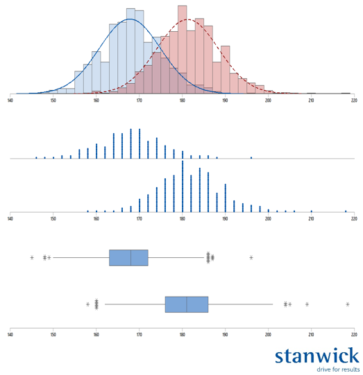
The "Histogram": the workhorse of basic statistics.
A "Histogram" shows the data, counted or measured, with the measurement or count value on the x-axis and the frequency of occurrence on the y-axis. The x-axis is divided into so-called bins.
These bins divide the x-axis into equal parts and limit the extreme values on the low and high side per bin. All values that fall within these extremes then determine the frequency per bin. In the example, each bin is 2.5 cm wide. Every body length between 180 and 182.5 cm falls within the red bar.
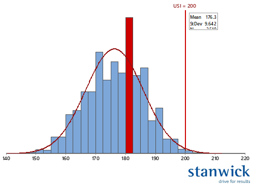
With the right software, a statistical distribution can also be added to such a histogram. And once the parameters of such a distribution are known, the path of statistics can really be taken. Here is a simple example of the predictive power of statistics. Even though there are currently no products that exceed the above-specification, you can discover with a fairly simple calculation that with unchanged process parameters the expected failure rate is greater than 2%.
The "Dot plot": for if you want more details about the individual values..
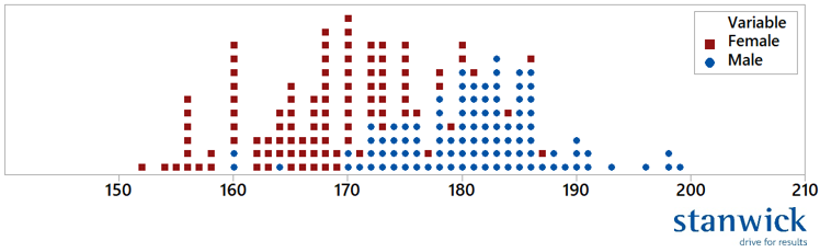
The "Dot plot" focuses more on the individual values of the presented data. In this example, I first randomly selected 100 women and 100 men and then created a combined dot plot. This allows you to see the overlap of the two populations on an individual basis very nicely. Perhaps the only limitation of the dot plot is that it easily becomes overloaded when there are a large number of measurements. That is why I first made a selection here and did not work with the full data set.
The "Box Plot": the quick analysis tool looking for extreme points in the data set.
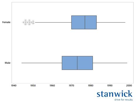
The "Box Plot" is one of my personal favourites. It shows me very quickly whether a process suffers from extreme values. We call these 'Outliers'. Conceptually, these measurements fall outside 3 times the standard deviation of the process.
So you can see that in my example file, only the women have a group of points marked with an asterisk. These points therefore fall outside the expected variation. By the way, this graph does not show the body lengths but the birth years of the participants.
There is also an anecdote here. It takes place at the beginning of my consultancy career. One morning, two participants in a green belt are seriously arguing. The quality manager claims that production has started using a new batch of a seemingly unimportant part during the night. However, they forgot to measure and adjust, resulting in a loss of quality. All batches made during the night therefore have to go through the inspection station again. The production manager does not deny this, but protects his operators and points to the low occupancy during the night and the high work pressure. He adds that the re-inspection is not his responsibility. I see this as a nice exercise on the use of graphs. I ask both of them if I can have the in-line test data for that night and also ask if they can somehow find out when the switch would have happened. I receive the data in the course of the morning, the time of the switch I get around 4 pm from the operator of the night. After 5 minutes of tinkering, I can see from a combined histogram that only the 4th and 5th baths produced need to be retested. This way, both gentlemen (OPS & QC) can come to an agreement and divide the extra work between both teams.
In the next part, I will talk about graphs showing time effects. And I would like to make a bold statement here myself. One such chart is the "Control Chart". This chart should be familiar to every quality, process or production engineer. After all, it is this chart that distinguishes between common cause (stable) variation and special cause variation. Certainly for companies that consider quality of paramount importance, this is the tool par excellence.
Kurt Maegherman